
Studio: Academy Xi
Client: Pitcher Partners
The Graduate Program

Late last year Picther Partners agreed to update their website, it currently attracts over 250,000 visitors each year.
This crowd is built up of Prospects, clients and job-seekers (in Melbourne alone PP employ over 250 people annually) I have been given the job of working with both a marketing and UX company to find out what currently works/ doesn’t and how we can improve the look, feel and functionality moving forward.
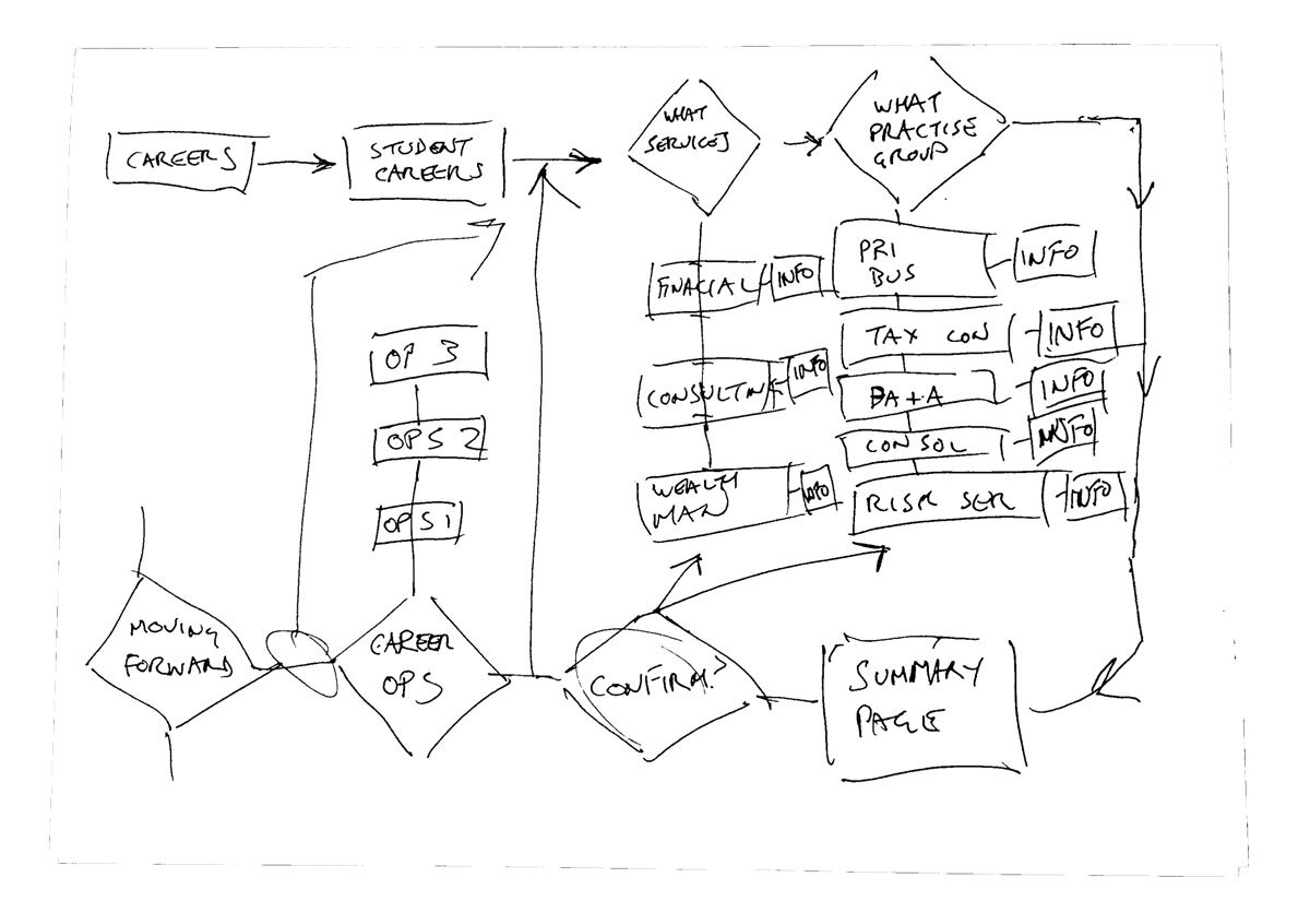
Due to time, for this project I have focused on looking at the Grad information and application part of the website. A main focus is to make it more client focused
So my problem became:
“How might I understand how our clients, prospects and graduates find information about the company so I can create a simpler and easier experience for them”
Stage 1. Interviews:
7 interviews conducted, talked to Graduates and Vacationers (past and present, 6 Melbourne based and 1 Nationally
Key Insights
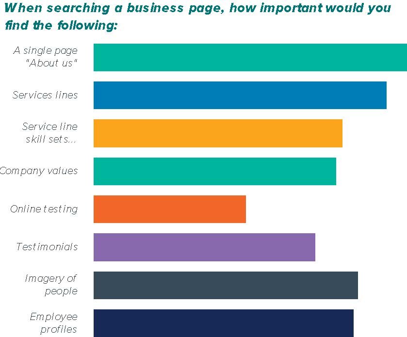
“About us section was challenging to navigate, just wanted a one liner about the firm”
“One of the questions on the application related to the firms values which I had to find in a roundabout way”
“The department I wanted wasn’t called the same thing as the service line, so I didn’t know if the Department was for me?”
“I didn’t like the ambiguity with some pages”
“I think the biggest thing that would have swayed me was knowing exactly the type of work I would be doing as it would make my decision easier ”

Stage 2. Surveys & Competitor analysis:
Findings:
Affirmed web based solution
Gave us new insights that we didn’t get in the interviews:
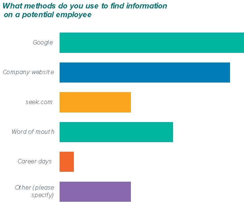
Linkedin
Glass Door
Need for website & keep 3rd party websites up to date
“I found Deloitte’s website quite easy to navigate as each service line was broken up and there were sections with something along the lines of ‘this role would be good for someone who has the following skills’ and ‘the types of work you would be doing includes’. I found that really useful as I could compare my skills with those required and then see if I liked the type of work that I would potentially be doing”

Stage 3. Affinity & Empathy Mapping:
Key Insights
A easy to navigate flow through process would need to be implemented
The detailed summaries were good but needed to be linked with the in-house departments
More knowledge around careers opportunities within each practice area
Previous stories and experiences were vital when choosing a career path
Really liked the use of people imagery (employees)
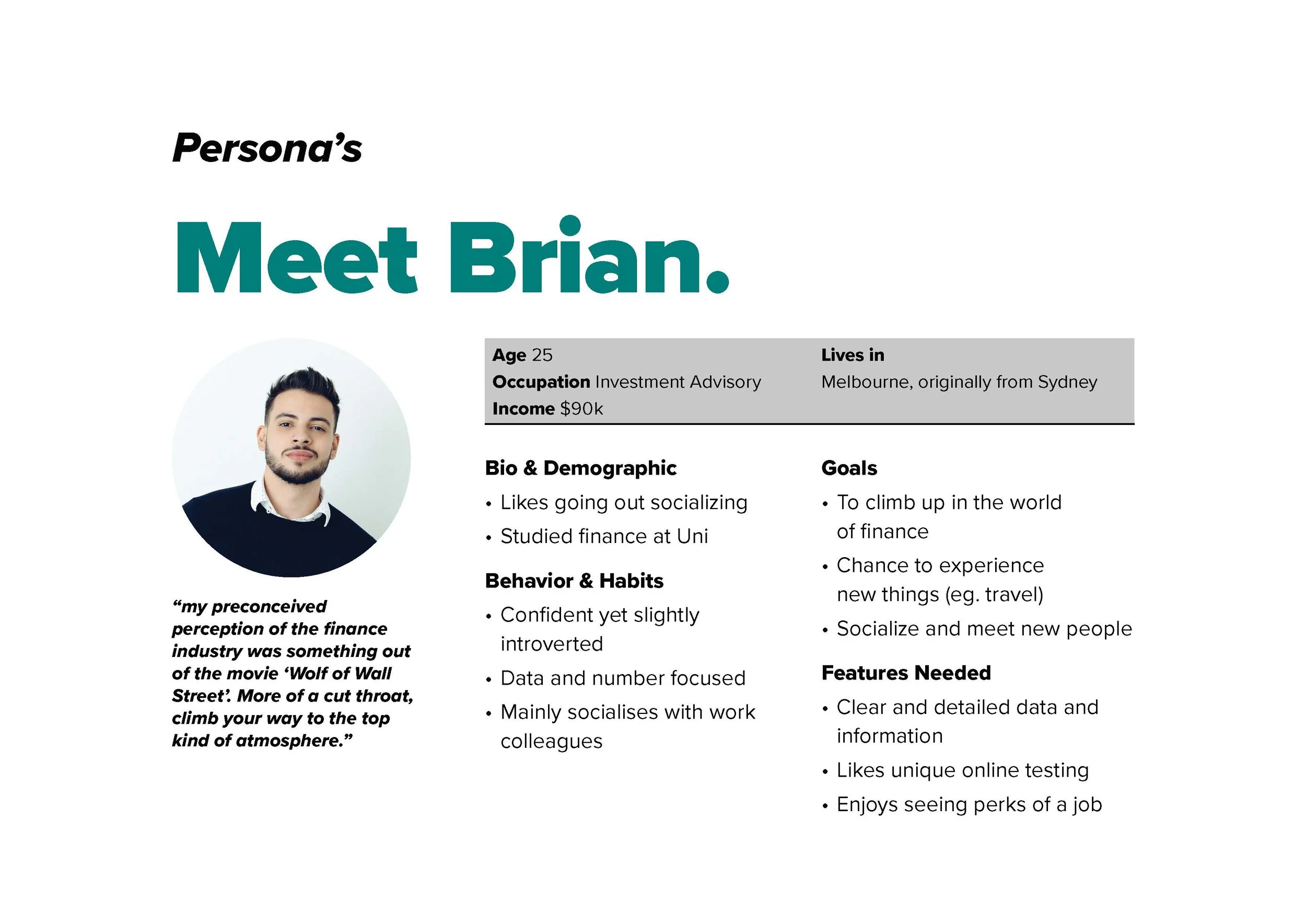
Stage 4. Personas & Customer Journeys:

So after all this analysis my vision statement became clear:
“To offer a easy process for acquiring company
information and course application”
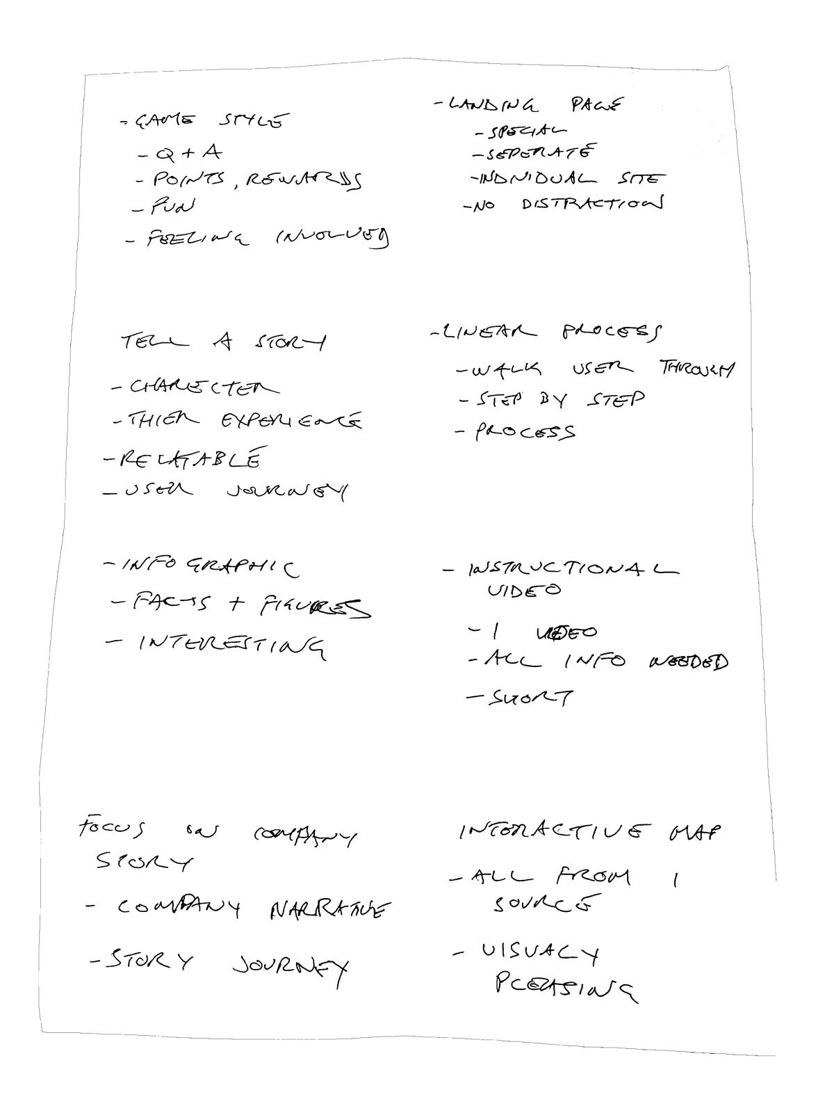
Stage 5. Ideation:
Key Insights
Ended up using multiple ideas from each solution
Subconsciously was developing a consistent solution
Thinking blue sky helped open up possible solutions
Internal people come with blue sky ideas that we reject, instead will use MVP
MVP and User Workflows key insights
Always too close to the problem, let others critique/ throw rocks at it
Keep checking users needs Get better at separating user flows and work flows Keep refining

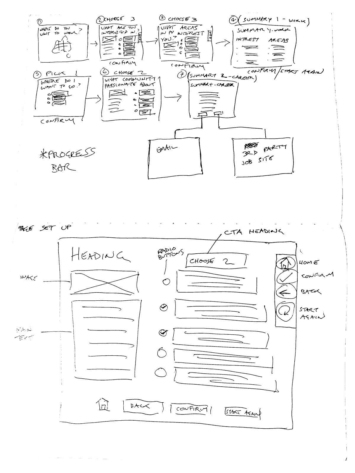
Stage 6. Prototyping:
Key Insights
People make assumptions - (About me on the front page means they are not a big company)
People will click things that when asked, don’t think should be clickable
People don’t read and go straight to clicking things
Remember context (didn’t know the map of Australia)
Always include back buttons (got nervous and double click ahead)